Principles for Creating Effective Data Visualization

Atika

In my experience working with customers over various domains over the last few years, I believe it’s important that people realize the basics of Data Visualization. One common mistake, I have seen people make is that they try to absolutely replace traditional reports with Dashboards completely, not realizing that the dashboards serve a different purpose.
I have tried to come up with a few important points that will help Developers, Business Analysts, End Users, clients or anyone who wants to create or use dashboards.
Before diving into technical stuff, let’s look at what Data Visualization is, and its concepts.
Simply put, Data visualization is the presentation of data in a pictorial or graphical format. One needs to understand the significance of data by placing it in a visual context.
Old Way: Below data is represented in spreadsheet form, try to answer following questions:
1. Which month produced the greatest sales?
2. Which region generated the lowest amount of sales in any month? What was the amount?
3. Which region generated the most sales and which was second?
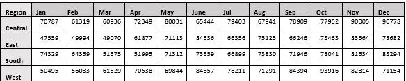
Think about the number of values you have to remember, and how many times you need to go back to previous month to read the value again.
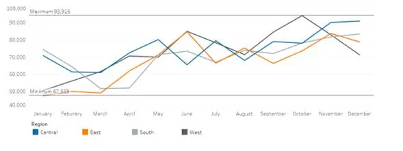
New way: Try answering the same set of questions using the below view.
Tufte’s design rules
Edward Rolf Tufte is an American statistician and professor emeritus of political science, statistics, and computer science at Yale University.
Tufte: “Only a picture can carry such a volume of data in such a small space”
See the example below:
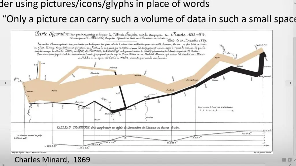
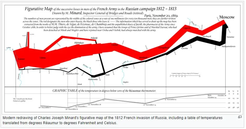
Charles Minard’s map of Napoleon’s disastrous Russian campaign of 1812. The graphic is notable for its representation in two dimensions of six types of data: the number of Napoleon’s troops; distance; temperature; the latitude and longitude; the direction of travel; and location relative to specific dates.
Design principles for effective data visualization
1. Know your Audience: it’s important to understand the intention of the end user when using the dashboard. For example, a Finance CEO will have different questions and interests in data when compared to the Social Media Analyst. Follow the steps:
a. Answer the right questions
b. Start with requirements
c. Find metrics that matter
2. Know your Data: Understanding the data you are working with makes it easier for the developer to take important decisions and steps during designing. For example, when you know monthly Billed Hours for an employee shouldn’t cross 250 hours in general and you get values in thousands you know something is not right with the data.
Take care of the following when designing:
a. Dimensions and Measures
b. Hierarchies and Relationships
c. Expected ranges, Visual interest
d. Change your perspective
3. Know your message: Find the story in your data. Dashboards tell the story behind the data. Every dashboard answers a specific set of questions, keep an eye out for a dip or peak in data.
4. Use effective tools
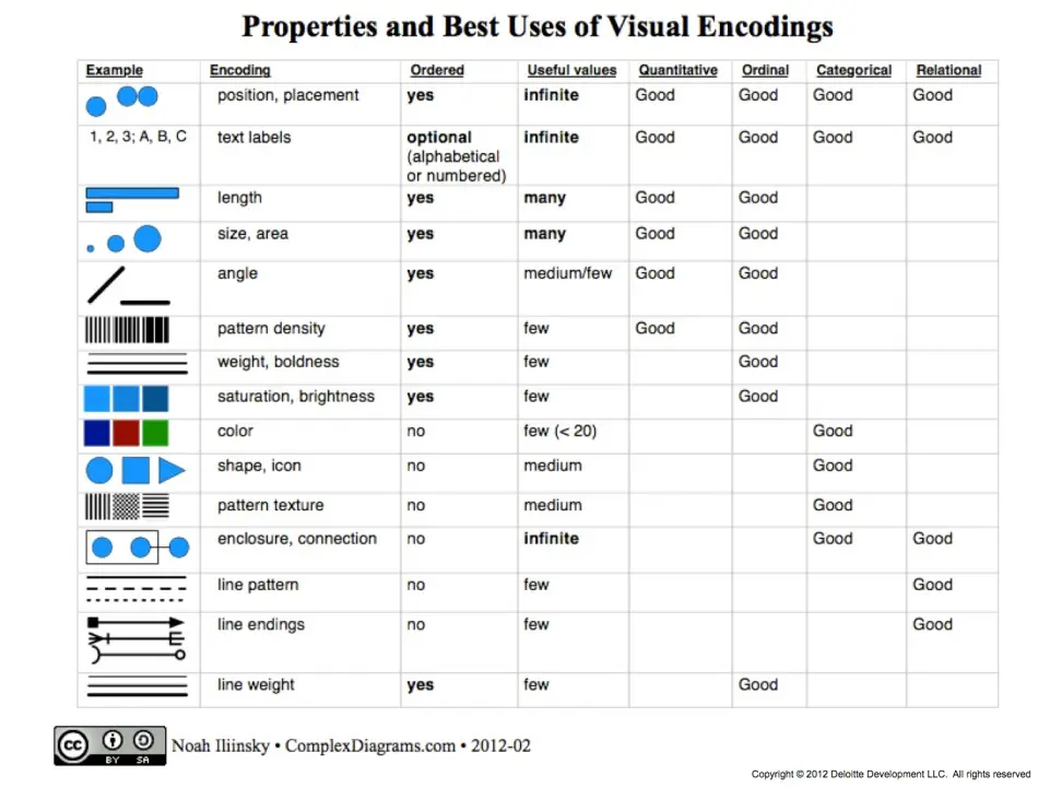
a. Visual encoding
b. Natural Query Language: One can leverage the natural query language feature in PowerBI.
c. Tableau Show Me: For example Show me feature in Tableau will suggest you the chart type based on the columns you have selected to design.
d. Online Example: Take hints from various sites, a few mentioned here
i.https://powerbi.microsoft.com/en-us/documentation/powerbi-sample-datasets/
ii. http://community.powerbi.com/t5/Data-Stories-Gallery/bd-p/DataStoriesGallery
iii. https://public.tableau.com/en-us/s/gallery
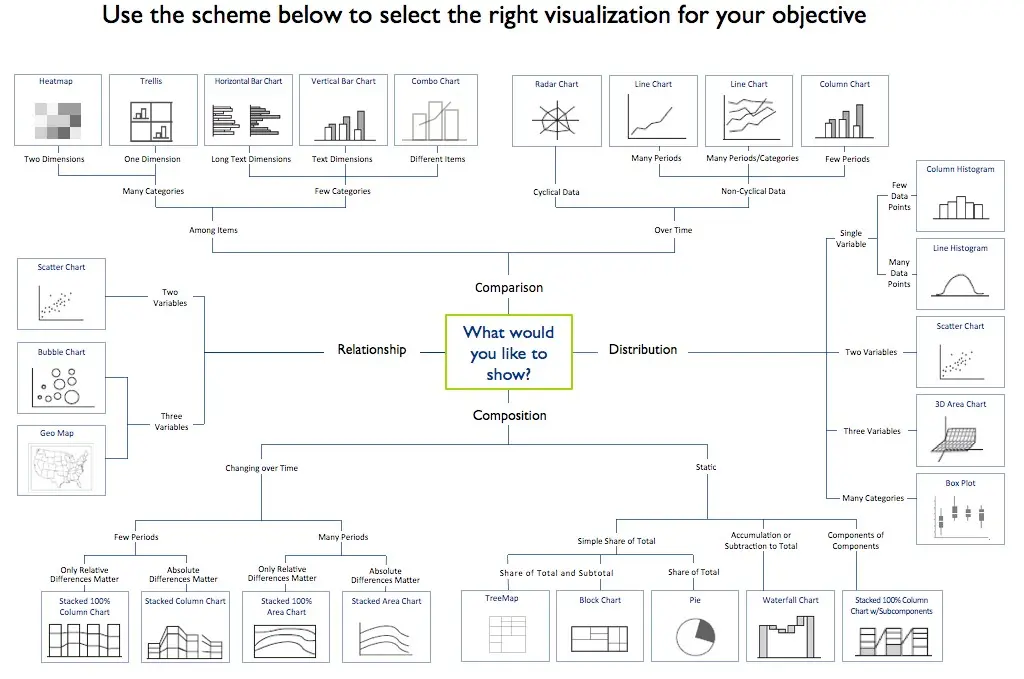
e. Use the below guide to refer to right chart based on your objective:
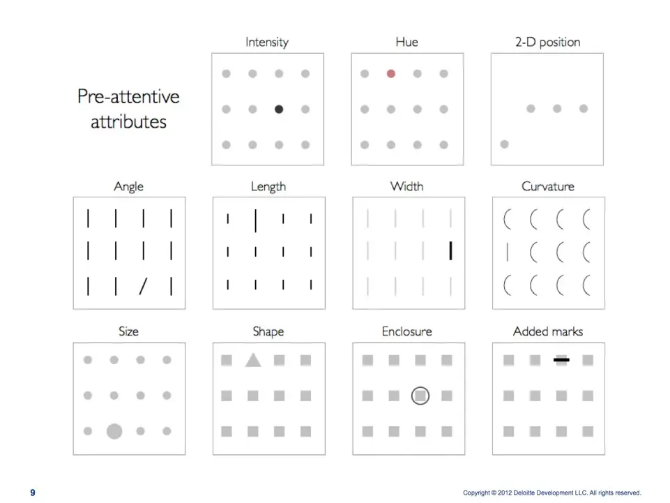
5. Use pre-attentive attributes: A pre-attentive visual property is one which is processed in spatial memory without our conscious action. The human visual system pre-processes some visual attributes which can be recognized very quickly and stand out in our perception. Pre-attentive attributes are based on Gestalt principles and include color, size, shape, proximity, continuity, closure, and similarity. The goal is to enable pre-attentive search and to avoid the creation of conjunction search and interference effects or in simple words use the pre-attentive attributes to maximize the effect of visualization and minimize the effort of the user. The four pre-attentive visual properties are as below:
a. Color
b. Form
c. Movement
d. Spatial Positioning
6. Sketch it out: Before getting your hands on the tool for creating dashboards, it’s advisable to first sketch the design. Maybe using wireframes or simply drawing on board. It will save you lot of time rather than changing the dashboard every time.
7. Keep it simple: People try to over complicate dashboard by sometimes using complicated charts,where simple charts would suffice or adding more and unnecessary information just because of filling in space. In such cases, many a times users tend to give up on the dashboard. Dashboards should be kept as simple as possible, one shouldn’t need proper training to use dashboard, basic training is still fine. Dashboard needs to be intuitive.
8. Data-ink ratio
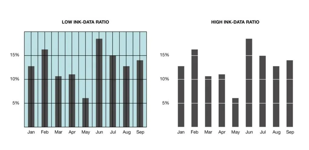
9. Chartjunk: It refers to all visual elements in charts and graphs that are not necessary to comprehend the information represented on the graph, or that distract the viewer from this information. Any ink on your chart that does not convey data is considered junk.
A few more tips :
• Use Color Blind color palette: In order to make your dashboard usable and effective to all, you can use the Color Blind colors. Many tools like Tableau have inbuilt Color Blind palette help you.
• Say no to scroll in design: Avoid adding too many charts. Data visible at shot makes the most impact.
• Data on each screen should be relevant, if the design gets too complicated, consider breaking down to multiple dashboards.
Conclusion
Data Visualization is more than just plotting graphs and pretty charts. It’s important that it delivers its message effectively. I hope these mentioned points will help you to get started, save your time and effort and deliver better dashboards. In other words, this should help you in unveiling insights faster and enhance strategic and operational decision-making.