Theory of FLAT DESIGN

Gopi

Looking at the way new iOS and Android releases are adapting to a different design approach, latest by Windows 10, one thing which comes to our mind is why such a drastic change from rich graphical brilliance to a modest, simple and to some of them boring design came up as a new emerging trend for design. Did I say boring? That’s what some customers think when we present a concept where everything seems like FLAT.
• What exactly is Flat Design?
• Why a Flat Design?
Let’s get to each of the points
I was working for an advertisement company as graphic designer and we used to design print ads for newspapers, pamphlets, brochures for companies. We had a lots of limitations in design as print design always were supposed to be FLAT in nature so that when people read it is crystal clear to them and also if there was too many gradients or 3D graphic element printing the same became a challenge and also not cost effective, but then people were used to it and wanted to have more and more of Flat structure rather than heavily graphic oriented objects. Everything got changed when we got into digital medium where design started to love complex designs and wanted to see more of a real life depiction rather than having flat concept. Example is instead of showing a simple table based calendar why can’t we have calendar like what we have it in our desks.
So all I can say is FLAT Design is not a new concept, Print medium were already doing it when there was not digitalization.
So now what exactly is Flat Design?
Flat design is more of sophisticated cousin of minimalism. When we say minimalism, it does not mean no design, these designs can handle complexity to greater extent. These designs have a crispness and clarity that can only be achieved by stripping away three dimensional effects.
So iOS 5 news stand like the one below
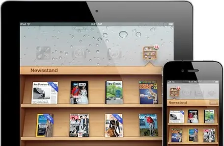
Became
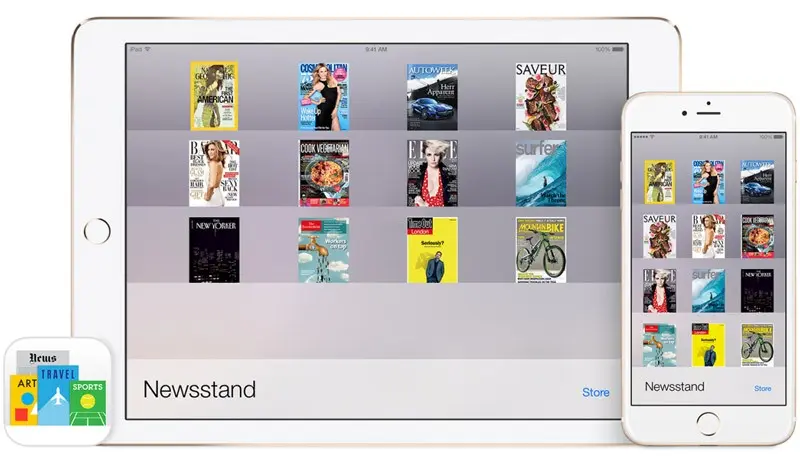
Visually Rich looking Calendar

Became
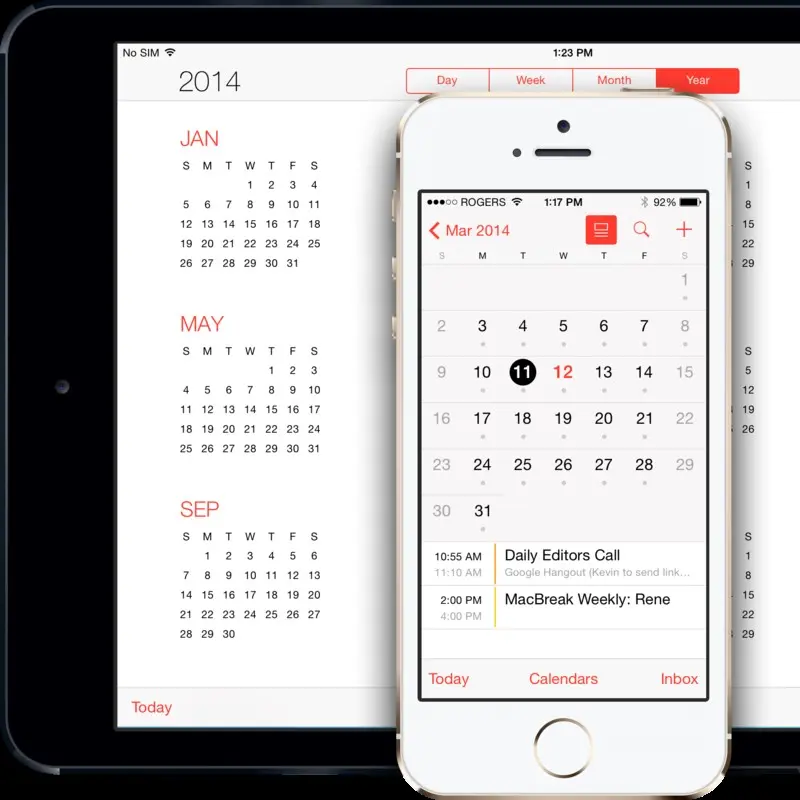
If you see in all these examples for iOS 5 vs iOS 8, there is never a bad design then or good design now, it is just that concept of visualization was rendered differently. Meaning, before say 5 or 6 years, emphasis was more on bringing real life scenario to digital world like the news stand app of iOS people were jumping to excitement and many managers/customers used to give an example to their designers saying look at iPhone they have brought in real shelf to ipads/iphone, I want it like this in my App or Site.
Why a Flat Design?
What made people jump to Flat designs, here are reasons for it:
1. Flat Design aims at focusing more on usability, and less on familiarity.
2. The idea is that our minds don’t need complex visual representation to understand what we are looking at. We are perfectly capable of recognizing shapes and giving them meaning with minimal visual cues.
3. By minimizing design, we are removing unnecessary distractions that otherwise have no definitive purpose, and may only distract us from the purpose of the application.
4. Lastly the mobile first approach with responsive design becoming so important, flat design makes it much easier to adjust to multiple screen sizes without the extra unnecessary graphics.
So summarizing why Flat Design:
• Users becoming very much familiarized with the way web works.
• The rise of mobile devices.
• The new developments in web technologies.
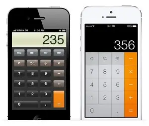
Google now emphasized on Flat Designs and then iOS 7 followed by getting away from the traditional skeuomorphic (https://en.wikipedia.org/wiki/Skeuomorph) apps such as the Calculator app.
This all started with Windows 8 when they broke all rules and added complete new angle to design, even though many people criticized the approach:
Read this: http://www.nngroup.com/articles/windows-8-disappointing-usability/
Problem with Windows 8 was that they emphasized more and more only on the tile theory and forgot to read users mind, but apart from all criticism not to forget that they really re-invented flat design concept at least according to me they are the pioneers. With Windows 10 it looks like they really researched a lot and learnt from their mistakes and back on track.
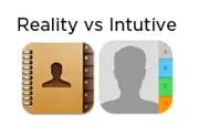
Icon Theory
Even as we speak about the design, all the iOS icons were changed purely based on eradication of the concept of skeuomorphism.
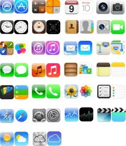
Looking at the above icons you can now make out why flat design.
Now will Flat Design survive?if yes, then what’s the next level to it? Well, we’ve seen in the past the trends in web design shift from highly glossy interfaces to realistic textured surfaces to basic solid colors each subsequent trend being a direct opposite of the last.
So what will happen to Flat Design, well as people say flat design is here to stay but will evolve into a new form, maybe entirely to new direction.